Cart abandonment: 10 reasons shoppers leave checkout
Seven in ten carts end without an order. Some shoppers just compare prices, while shipping costs, forced accounts, or missing parcel lockers stop others. Here is what to fix.
Visitors form a first impression before reading a word and decide within seconds whether to stay. Here is what must be clear at the top and how to test it in an afternoon.
Good homepage design must show who you are, what you offer, who it is for, and what to do next within the first few seconds. Visitors form a first impression before reading a single word, and decide within ten to twenty seconds whether to stay.
We summarize research on first impressions and online reading, five questions for the top of the page, common business website mistakes, and how to test your site with five people in one afternoon.
In a 2006 study by Gitte Lindgaard and colleagues, people rated website appeal the same after 50 milliseconds as after a longer look. Good looks open the door, but without a clear offer they keep no one. We cover this further in our article on how emotions and the subconscious mind drive our decisions.
In 2010, Chao Liu, Ryen White, and Susan Dumais at Microsoft Research analyzed 205,873 pages. In a 2011 article, Jakob Nielsen of Nielsen Norman Group concluded that people often leave within 10 to 20 seconds—yet a page with clear value can hold them for several minutes.
Your homepage works like a shop window on a busy street: passersby stop for a clear selection, not for decorations.
A website needs clarity, not effects: a clean layout, a readable headline, and a plain offer. Animations and large photos must not hide the message or slow down loading.
The top of your homepage—what visitors see without scrolling—must answer five questions. This aligns with the 2024 five homepage design principles from Nielsen Norman Group: clearly show who you are, what you do, and what to do next.
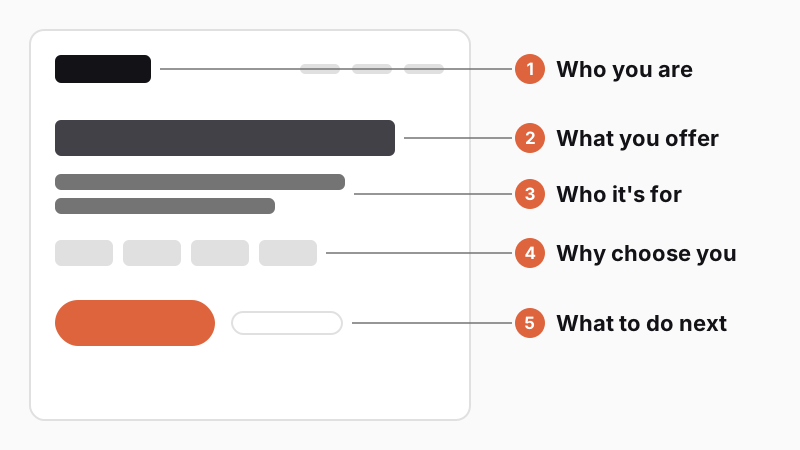
How does this look in practice? A made-up auto repair shop puts "Car service and repairs in Kolín" at the top, adds a subheadline about servicing all makes and providing a loaner car, shows customer ratings, and includes a "Book service online" button. A made-up accounting firm writes "Accounting and taxes for freelancers and small businesses," mentions remote collaboration, and backs it up with years of practice and client industries. For lawyers, see our 5 website tips for a law firm.
Neither example needs words like "welcome," "quality," or "professional"—it gives only concrete facts for making a decision.
People do not read websites word by word; they scan. Nielsen Norman Group has tracked eye movements since 2006, when it described the F-shaped pattern, and Kara Pernice confirmed in a 2017 summary that it holds on both desktop and mobile. Readers read the first lines, shorten the next ones, and finally skim down the left edge, missing line ends and the bottom.
In the layer-cake pattern, readers scan only headings and stop at relevant sections. On mobile, marking dominates: the eyes stay fixed while a finger scrolls the text, so the main point must be visible before scrolling.
Rules for web copy:
The most common mistakes on business websites waste prime space on things that tell visitors nothing. You can fix most of them just by rewriting the copy at the top of the page.
| Mistake | Why it hurts | What to use instead |
|---|---|---|
| "Welcome to our website" | Wastes the main headline and says nothing | A headline stating what you offer and to whom |
| Rotating slider | People see only the first slide or none | One main message and one photo |
| Stock photos | Feel impersonal and prove nothing | Photos of your work, team, and premises |
| Vague "Learn more" button | Visitors do not know what happens next | A specific action: "Book service" |
| Immediate pop-up | Covers content before visitors know where they are | Show the offer only after they read the page |
| Cookie banner covering half the mobile screen | Hides the headline and button | A compact bar at the bottom edge |
Rotating sliders stay popular even though research speaks against them. In 2013, Jakob Nielsen described a test where a user missed a washing machine discount because the panel auto-advanced before she could read it; the deal was visible only about 20% of the time. Motion looks like an ad, which people ignore, and hurts accessibility. The next slide should appear only when the user asks for it.
Pop-ups right on arrival do similar harm. Nielsen Norman Group advises skipping them unless required by law. Google advises against covering page content; legally required notices are exempt, yet even those need not cover half a phone screen. We cover the link to accessibility in web accessibility and the law.
When someone arrives from an ad, the page must pick up right where the ad left off. This is called message match: the headline and offer match the ad, so visitors know right away they are in the right place.
If an ad for "Winter tires fitted within 24 hours" leads to a generic auto shop homepage, visitors have to hunt for the offer and often leave. Take them straight to winter tires with pricing and a booking button, and they continue without hesitation.
Google evaluates message match too. According to Google Ads help on Quality Score, landing page experience is one of three components of this score, revealing weak spots in your ads. We explain full campaign setup in how to run a successful online PPC campaign.
Check four things for message match:
A dedicated landing page pays off for a specific offer your general homepage does not cover. It has one goal, one main button, and no menu distractions. If you promote three distinct services, point each ad to its own landing page, not a homepage hub.
Usability testing with people unfamiliar with your site is the cheapest way to see whether your business website works. A five-second test and a task test with five people are enough—you can run both in one afternoon without paid tools.
The five-second test checks whether the top of your page answers the five questions above:
A task test shows whether people find what they need. Prepare three to five tasks (for example, "Find out how much an oil change costs" or "Book an appointment"). The participant completes the tasks while thinking aloud. Do not give hints; note every hesitation.
In his 2000 article on why you only need to test with five users, Jakob Nielsen notes that five people uncover roughly 85% of usability problems. Three rounds of five users with fixes in between work better than one big test. If you serve distinct groups (businesses and households), test three to four people from each.
An A/B test compares two page versions and requires thousands of visitors. To lift conversion from 2% to 2.5% at 95% confidence and 80% statistical power, a site needs roughly 14,000 visits per version (about 28,000 total). At 3,000 monthly visits, that takes over nine months. For a small site, user tests are faster and cheaper.
Here is how rewriting the top of a homepage looks for a made-up joinery workshop.
| Element | Before | After |
|---|---|---|
| Headline | Welcome to our joinery website | Custom solid-wood kitchens and built-in wardrobes |
| Subheadline | A family business with tradition and a focus on quality | We design, build, and install. For apartments and houses in Brno and nearby |
| Proof | Stock photo of a forest | Photos of finished kitchens and customer reviews |
| Button | Learn more | Book a measurement |
The original version is too vague. The rewrite answers all five questions:
Follow the same pattern: a standalone headline, a clarifying subheadline, one strong piece of proof, and an action button. Verify the result with a five-second test.
Check mobile too. The headline, subheadline, and button must all fit on the first screen without scrolling—uncovered by a huge photo, cookie bar, or chat widget. For online stores, this clarity matters all the way to checkout; read more in our article on why shoppers abandon carts.
We start every new website with research and design, and we build brochure websites from CZK 30,000. You can get a ballpark estimate in our project configurator.
The top of your homepage should answer five questions: who you are, what you offer, who it is for, why choose you, and what to do next. That means a logo and name, a specific headline, a subheadline for your audience, ratings or testimonials, and one clear button. Below that go your services, work samples, and contact details.
Drawing on Microsoft Research data (2010), Jakob Nielsen of Nielsen Norman Group found that people often leave within 10 to 20 seconds. When they grasp the page's value right away, however, they stay for several minutes.
Auto-rotating sliders usually hurt performance. Visitors see only the first slide, tune out motion like banner ads, and cannot read in time. Jakob Nielsen of Nielsen Norman Group recommends changing slides only on user action. One clear message with one photo works better.
Five people are enough for qualitative usability testing—according to Jakob Nielsen, they uncover roughly 85% of issues. Several small rounds with fixes in between beat one large test. If you serve distinct customer groups, test three to four people from each; statistical measurement requires larger samples.
Handpicked topics for you
Seven in ten carts end without an order. Some shoppers just compare prices, while shipping costs, forced accounts, or missing parcel lockers stop others. Here is what to fix.
To turn visitors into clients, a website needs to answer their questions and deliver a positive user experience.
Most of our decisions happen subconsciously. How can you use this in sales and marketing?
Visitors form a first impression before reading a word and decide within seconds whether to stay. Here is what must be clear at the top and how to test it in an afternoon.
Good homepage design must show who you are, what you offer, who it is for, and what to do next within the first few seconds. Visitors form a first impression before reading a single word, and decide within ten to twenty seconds whether to stay.
We summarize research on first impressions and online reading, five questions for the top of the page, common business website mistakes, and how to test your site with five people in one afternoon.
In a 2006 study by Gitte Lindgaard and colleagues, people rated website appeal the same after 50 milliseconds as after a longer look. Good looks open the door, but without a clear offer they keep no one. We cover this further in our article on how emotions and the subconscious mind drive our decisions.
In 2010, Chao Liu, Ryen White, and Susan Dumais at Microsoft Research analyzed 205,873 pages. In a 2011 article, Jakob Nielsen of Nielsen Norman Group concluded that people often leave within 10 to 20 seconds—yet a page with clear value can hold them for several minutes.
Your homepage works like a shop window on a busy street: passersby stop for a clear selection, not for decorations.
A website needs clarity, not effects: a clean layout, a readable headline, and a plain offer. Animations and large photos must not hide the message or slow down loading.
The top of your homepage—what visitors see without scrolling—must answer five questions. This aligns with the 2024 five homepage design principles from Nielsen Norman Group: clearly show who you are, what you do, and what to do next.
How does this look in practice? A made-up auto repair shop puts "Car service and repairs in Kolín" at the top, adds a subheadline about servicing all makes and providing a loaner car, shows customer ratings, and includes a "Book service online" button. A made-up accounting firm writes "Accounting and taxes for freelancers and small businesses," mentions remote collaboration, and backs it up with years of practice and client industries. For lawyers, see our 5 website tips for a law firm.
Neither example needs words like "welcome," "quality," or "professional"—it gives only concrete facts for making a decision.
People do not read websites word by word; they scan. Nielsen Norman Group has tracked eye movements since 2006, when it described the F-shaped pattern, and Kara Pernice confirmed in a 2017 summary that it holds on both desktop and mobile. Readers read the first lines, shorten the next ones, and finally skim down the left edge, missing line ends and the bottom.
In the layer-cake pattern, readers scan only headings and stop at relevant sections. On mobile, marking dominates: the eyes stay fixed while a finger scrolls the text, so the main point must be visible before scrolling.
Rules for web copy:
The most common mistakes on business websites waste prime space on things that tell visitors nothing. You can fix most of them just by rewriting the copy at the top of the page.
| Mistake | Why it hurts | What to use instead |
|---|---|---|
| "Welcome to our website" | Wastes the main headline and says nothing | A headline stating what you offer and to whom |
| Rotating slider | People see only the first slide or none | One main message and one photo |
| Stock photos | Feel impersonal and prove nothing | Photos of your work, team, and premises |
| Vague "Learn more" button | Visitors do not know what happens next | A specific action: "Book service" |
| Immediate pop-up | Covers content before visitors know where they are | Show the offer only after they read the page |
| Cookie banner covering half the mobile screen | Hides the headline and button | A compact bar at the bottom edge |
Rotating sliders stay popular even though research speaks against them. In 2013, Jakob Nielsen described a test where a user missed a washing machine discount because the panel auto-advanced before she could read it; the deal was visible only about 20% of the time. Motion looks like an ad, which people ignore, and hurts accessibility. The next slide should appear only when the user asks for it.
Pop-ups right on arrival do similar harm. Nielsen Norman Group advises skipping them unless required by law. Google advises against covering page content; legally required notices are exempt, yet even those need not cover half a phone screen. We cover the link to accessibility in web accessibility and the law.
When someone arrives from an ad, the page must pick up right where the ad left off. This is called message match: the headline and offer match the ad, so visitors know right away they are in the right place.
If an ad for "Winter tires fitted within 24 hours" leads to a generic auto shop homepage, visitors have to hunt for the offer and often leave. Take them straight to winter tires with pricing and a booking button, and they continue without hesitation.
Google evaluates message match too. According to Google Ads help on Quality Score, landing page experience is one of three components of this score, revealing weak spots in your ads. We explain full campaign setup in how to run a successful online PPC campaign.
Check four things for message match:
A dedicated landing page pays off for a specific offer your general homepage does not cover. It has one goal, one main button, and no menu distractions. If you promote three distinct services, point each ad to its own landing page, not a homepage hub.
Usability testing with people unfamiliar with your site is the cheapest way to see whether your business website works. A five-second test and a task test with five people are enough—you can run both in one afternoon without paid tools.
The five-second test checks whether the top of your page answers the five questions above:
A task test shows whether people find what they need. Prepare three to five tasks (for example, "Find out how much an oil change costs" or "Book an appointment"). The participant completes the tasks while thinking aloud. Do not give hints; note every hesitation.
In his 2000 article on why you only need to test with five users, Jakob Nielsen notes that five people uncover roughly 85% of usability problems. Three rounds of five users with fixes in between work better than one big test. If you serve distinct groups (businesses and households), test three to four people from each.
An A/B test compares two page versions and requires thousands of visitors. To lift conversion from 2% to 2.5% at 95% confidence and 80% statistical power, a site needs roughly 14,000 visits per version (about 28,000 total). At 3,000 monthly visits, that takes over nine months. For a small site, user tests are faster and cheaper.
Here is how rewriting the top of a homepage looks for a made-up joinery workshop.
| Element | Before | After |
|---|---|---|
| Headline | Welcome to our joinery website | Custom solid-wood kitchens and built-in wardrobes |
| Subheadline | A family business with tradition and a focus on quality | We design, build, and install. For apartments and houses in Brno and nearby |
| Proof | Stock photo of a forest | Photos of finished kitchens and customer reviews |
| Button | Learn more | Book a measurement |
The original version is too vague. The rewrite answers all five questions:
Follow the same pattern: a standalone headline, a clarifying subheadline, one strong piece of proof, and an action button. Verify the result with a five-second test.
Check mobile too. The headline, subheadline, and button must all fit on the first screen without scrolling—uncovered by a huge photo, cookie bar, or chat widget. For online stores, this clarity matters all the way to checkout; read more in our article on why shoppers abandon carts.
We start every new website with research and design, and we build brochure websites from CZK 30,000. You can get a ballpark estimate in our project configurator.
The top of your homepage should answer five questions: who you are, what you offer, who it is for, why choose you, and what to do next. That means a logo and name, a specific headline, a subheadline for your audience, ratings or testimonials, and one clear button. Below that go your services, work samples, and contact details.
Drawing on Microsoft Research data (2010), Jakob Nielsen of Nielsen Norman Group found that people often leave within 10 to 20 seconds. When they grasp the page's value right away, however, they stay for several minutes.
Auto-rotating sliders usually hurt performance. Visitors see only the first slide, tune out motion like banner ads, and cannot read in time. Jakob Nielsen of Nielsen Norman Group recommends changing slides only on user action. One clear message with one photo works better.
Five people are enough for qualitative usability testing—according to Jakob Nielsen, they uncover roughly 85% of issues. Several small rounds with fixes in between beat one large test. If you serve distinct customer groups, test three to four people from each; statistical measurement requires larger samples.
Handpicked topics for you
Seven in ten carts end without an order. Some shoppers just compare prices, while shipping costs, forced accounts, or missing parcel lockers stop others. Here is what to fix.
To turn visitors into clients, a website needs to answer their questions and deliver a positive user experience.
Most of our decisions happen subconsciously. How can you use this in sales and marketing?